Pages
▼
Saturday, November 13, 2010
IMC Wrap-UP
I won't be too hard on myself for not completing this series of blog entries months ago while the memories were still fresh in my mind. My goal here is to share a bit on the painting process. Shown above is where I was around the second-to-last day. One problem was that I had mounted prints that were too thin for Donato's process. A heavy ridge also developed along the line I tried to cut around some of the major contours of the illustration in order to better conceal them. I had managed to get some momentum going with my usual acrylics glazing technique. But I had also, somehow, lost my focus on the legs, and found myself having to repaint and adjust them on the fly. Thinking back, part of the conflict may have arisen from Dan Dos Santos' suggestion to "glam her up a bit" by lengthening the legs and torso. I had to really force myself to abandon my goal of staying true to Michelle's actual proportions, which read as youthful, delicate and vulnerable.
Although the painting is still unfinished, I learned a bit more about where exactly in my process I need to increase my focus and momentum. The rendering of the underdrawing in charcoal was probably the most satisfying part of the process, even though it as time consuming. I'll have to see if I can approach the rest of the painting with a similar amount of enthusiasm and success.
View an update to this piece here.
Saturday, October 16, 2010
APE 2010
I had a really good time at APE this year in San Francisco, and actually spent some money this time. I thought I had written off cons for good, vowing to stay away unless I'm there to make money and promote my own work. But something drew me back to APE.
The event was considerably larger, with a lot more professional-level work on display. And it was a friendly, diverse crowd, with a broad range of genres and styles represented. Although, I found myself wanting to see more African and African-American artists, or at least more artists who draw and paint black characters. APE is still a very white and Asian event, which makes me appreciate ECBACC and OnyxCon even more. Nonetheless, I did manage to find several inspiring works to add to my collection, including prints and comics. One in particular was by Corey Bass (above). (http://c-tristan.deviantart.com/) He has his own world and mythos in the works, and has a real talent for nuanced and poetic storytelling. His drawing and painting skills are still developing, but I'm already looking forward to what he has on the table next year.
This was also the first time that I actually used the map in the program to bookmark tables with works I wanted to buy. The strategy worked well, although I lost track of a few tables because I started off marking the wrong wing of the Concourse. I also decided to travel light, and cut way down on the cards and leave-behinds. Illustrator Maggie Cheung (above) had a few really nicely drawn and painted prints. I picked up her "Monday" bear, and a vibrant sketch of a building in Hong Kong.
I also had the pleasure of meeting Mike Manomivibul (below) (http://www.mikemanoart.com)/2010/04/finally-moonfleet.html. His surreal ocean-themed illustrations remind me of Lovecraft's Dagon. I especially love how Manomivibul uses light and shadow, and a monochromatic color palette.
It's inspiring to see so many independent creators willing to invest time and energy into their dreams and passions. The best work came from artists who clearly had a phenomenal work ethic and a solid grounding in the fundamentals. But I still wonder what exactly leads one to a sense of belonging at these kinds of events. Some groups look like they're at a family reunion. It must be a matter of showing up regularly at many events and developing a following. Collaboration also seems to be a huge factor both in staying motivated, and having a sizable body of work to show.
Another master of grayscale is Grim Wilkins (below). His graphic novel "Love Story in the Woods" does a lot with few words, and some wonderfully dynamic compositions and marks. (http://grimwilkins.blogspot.com/)
Another to answer the "call" to do an independent comic was actually youth social worker by day. He shared with me that his semi-autobiographical strip was an important outlet. SJSU alum, Justin Orr also had a couple of great sketchbooks for sale. As did Argentinian concept artist Nicolas Villarreal. His book has an inspiring mix of environments and character concepts.
I wish I had the time to list and describe it all, but let's just say that APE 2010 was by far the most memorable comic book convention for me in a very long time. I'm looking forward to next year's.
Sunday, September 12, 2010
Drawn to Lee J. Ames
Back in the early 80s, Oxford Elementary (Berkeley, CA) had a second floor library. In one of the far corners of the library was the art section. It was there that I discovered my Lee J. Ames Draw 50 books, and I have been drawn to the 741s ever since. At a very early age, Lee J. Ames' books offered me the promise of drawing realistic boats, aircraft, even spaceships, as long as I had the patience and discipline to follow the steps.
But I never read the foreward, where he explained exactly how to use the books. It was the pictures that spoke to me. Had I followed his instructions to the letter, I undoubtedly would have gotten considerably more from the books, and developed much faster as a young artist. Out of curiosity, and an unexplainable need to revisit those joyous childhood forays into drawing, I visited the chidlren's section of the main branch of the Berkeley Public Library. I almost missed the book. It was now neighbors with a sizable "How to Draw Manga" collection. But I found a copy of Draw 50 Boats, Ships, Trucks, and Trains. And, I read the foreword. After 30 years, I finally read the foreword!
In the "To the Reader" section, I found the answers to why I rarely ended up with satisfying results after attempting one of his drawings. A successful copy of one of Ames' drawings requried that the first lines be drawn lightly and accurately, even though they are shown with relatively bold lines. He also suggests a series of light erasures with each step as you build up the details and forms, and finishing the drawing with either pen and ink, or a darker lead.
I still felt a twinge of fear and anxiety as a I attempted my first step-by-step copy of an Ames in over two decades. But to my surprise, once I started, and faithfully followed the placement and proportions of his marks, I was able to complete the drawing with relative ease, and a high level of satisfaction. Part of the fun in doing these exercises is that many of them start out as incredibly ambiguous forms. Some may initially reference a hull or a truck body, but others are a little less obvious. So there is an element of discovery, much like assembling a jigsaw puzzle, where the "big picture" slowly reveals itself, along with how the parts relate to the whole.
I worked through a few of the drawings this afternoon during the BART train ride to San Francisco and found myself smiling the whole time. All the while, a nagging voice suggested that I was might be wasting my time and undermining all that I have been trained to believe about how being creative demands that I avoid these regimented kinds of studies. What if one of my colleagues at CCA caught me doing this? Or even worse, what if a student saw? And what, if anything is the value in copying these drawings. Does it even qualify as drawing in the creative sense?
It was during the Chinese calligraphy workshop I took earlier this year that I saw the value of copying great works. Ames' lines are clean and confident, and expertly describe a broad range of forms and materials. In fact, it was his drawings that first explained to me how to construct a convincing cockpit canopy, or a foreshortened aircraft wing and body. I would later incorporate these little morsels of drawing wisdom into my own spacecraft and vehicle designs. And the books promote education beyond drawing. Artists should know the names of various ships, boats, and other vehicles, in addition to begin able to draw them convincingly. By recording such a variety of examples of vehicles and machines from his time in clear drawings, Ames brings me closer to a bygone era, while at the same time challenging me to apply his method today's inventions.
Thursday, August 19, 2010
Back to School
Fall Semester Begins at CCSF
Today ends our first week of instruction at City College of San Francisco. Due to scheduling constraint, I am unfortunately unable to continue with my Japanese studies. Thus far, I have completed one beginning kanji class, one beginning conversaitonal Japanese, and four semesters of the language and grammar classes. I think I made mention in the previous post of my near life-long fascination with Japan's anime and manga drawing styles. I was first introduced to these images in print through Japanese robot model kits. The instruction sheets and other inserts often included stills from animation cells, or other hand-drawn illustrations, often line art. They always had this incredible delicacy, even on complex mech designs, that allowed the color to breath freely within the lines. I've been trying to figure out how much of the drawing style reflects a cultural temperament or possibly even tradition evolved and transformed over time.
In studying the Japanese language, I discovered how useful mechanical pencils were in writing the language, particularly the kanji. Chinese characters, when written clearly with a sharp writing implement, can be difficult to draw at smaller scales, especially ones with many strokes. This is less so with the hiragana and katagana, which share the compact openness seen in Roman letters.
If I could confirm for myself the exact types of drawing tools (pencils, pens, etc.) that were used for animation cels, or the kinds of insert illustrations shown above, and the kinds of reproduction processes that might have been involved, I might be able to start incorporating these kinds of marks into my own work.
Fortunately, I have plenty of examples to study. My Mega Man X Official Complete Works (CAPCOM), for example, has tons of sketches and finished art from the games and animated series. I've only played the game a few times at a friend's house on the Nintendo 8-bit system, but I was really inspired by the vast universe of bizarre character and robot designs featured in the book.
Afroid.com update
In other news, I've started mapping out the core structure and some content for the Afroid site. The Afroid/Power Coil concept is a science fiction story that centers around a strange phenomenon that enables children to control their hair with their thoughts and a strange, new technology.
Wednesday, August 11, 2010
A Unique Anatomy for Artists Book
As a kid, I never had the patience to sit and read with full comprehension a book related to the complex subject of accurately and effectively drawing the human form. I'd occasionally flip through them in a bookstore or library, and take it home with the hopes that it will make me a better artist. Back then, my dream of becoming a comic book artist was inextricably linked to the need to develop the uncanny ability to convincingly depict the human form, male or female, from any angle, in motion, violent action, repose, etc. Many of my favorites were geared specifically toward comic books, while others took a more intimidating, almost scientific approach. The question of how best to study from these books has always been an issue for me. I have so many in my library, so how come I still struggle with this stuff?
The diagrammatic approach of measuring heads, and seeing basic forms as spheres, boxes and cylinders only got me so far. It always seemed to come down to a quesiton of memory and understanding the underlying mechanics and structure. This was different from the rigors of drawing the figure from life, which can be understood as a process of measuring and the appropriate application of marks, or the translation and organization of patterns of value.
As an undergrad, I was able to squeeze in two semesters worth of figure drawing. During the years after graduation, I enrolled two figure drawing and one portrait painting workshop through City College of San Franciso's Extended Education program. I have also committed many hours to open life drawing sessions and sketching in public. The problem was that I still could not draw the figure accurately, either from memory, or through observation. I could muddle my way through a loose, gestural drawing, with marks occasionally landing in the right place, but I still felt like something was missing. I worried that my instructors had placed such an emphasis on an expressive approach, that I might never develop the discipline and focus to truly draw what I see. The proportions were always approximate, the marks rushed. Where my drawings excelled in confidence and expressiveness, they failed in terms of sturcture. And when I tried to draw bodies from my imagination, I would usually revert back to old habits because the time in front of the model wasn't helping me to retain much.
It wasn't until I took an ecorché class with Carol Tarzier (also through CCSF Extended Ed.) that things finally started to stick. The class involved building a 1/8 scale armature and modeling the bones and muscles in plasticene. I was especially inspired Carol's ability to draw any bone or muscle group from memory and identify things like origins and insertions. At last, I had found the kind of anatomy for artists instruction that made sense to me. It was a holistic approach, that combined the disciplined rigor of careful measurement and accurate porportions, with a very hands-on and tactile approach to learning.
This afternoon, I came across a unique book entitled Anatomy for Artists: A New Approach to Discovering, Learning, and Remembering the Body by Anthomy Apesos (ISBN-13: 978-1-58180-931-2) at the San Francisco Public Library. Apesos' approach is to also present the body through a "hands-on" model where he gets the reader to engage with the material by using their own body. It's a simple, but highly effective approach to learning how the body works. Personally, I'm not very good at memorizing diagrams and formulas, although, I've learned several useful ones through the years. But I'm finding that when I can include a bit of movement and touch to my learning process, I seem to retain more.
If you're looking an anatomy for artists book that offers some valuable insights and a unique approach to the topic, I strongly suggest giving this book a read.
Digital Painting: Wacom Tablet Intensive @ CCA
Last Saturday marked the end of another digital drawing and painting workshop. The course involved two six-hour classes held on two consecutive Saturdays. I had a great group of enthusiastic students with backgrounds and interests that included textiles, illustration, industrial design, fine art drawing and painting, graphic design, and comic books/manga. Close to half of them were already owners and users of Wacom tablets, including the new Intuos 4.
What I like most about teaching the class is figuring out how to relate the digital tools to a broad range of mediums and techniques via the Photoshop environment. I also try to emphasize the importance of putting their ideas first, and then shaping the digital tools to specific needs. One student shared with me at the end that the class really helped her to overcome her anxieties about using the computer for her art.
The class is offered through the California College of the Arts Extended Education program.
The next workshop is tentatively scheduled for Saturday, October 2 & 9, 2010. The fall schedule of classes should be up in a few weeks.
http://www.cca.edu/academics/extended/courses/computers
Digital Drawing & Painting: Wacom Tablet Intensive (OAK 202) $260; 2 sessions
Tuesday, August 3, 2010
Drawing Circus : Paper Sculpture
Last night was the our last meeting of the Drawing Circus, a class facilitated by Edward Stanton at the Richmond Art Center (www.therac.org). Our performer wore a simple, loose-fitting dress with long sleeves and an elastic fabric. She performed with an armful of golf clubs, next to a large, gold-trimmed frame. I started with a single sheet of Blueline comic book paper, my two watercolor travel trays, and a pencil.The first marks were mostly lines and small shapes, and faint gradations of primary colors. Careful application of the watercolor started to define long, angular planes on the page that reminded me of my first Gundam model. It was a 1/144 scale Gundam Z, and one of the few kits that I actually tried to paint according to the instructions. Iron Horse on Solano Avenue in Berkeley carried an impressive selection of kits from the Gundam series, and for a while, I was really into them. The Gundam Z has long, elegant lines defining various parts of its armor, as well as a number of sections deliniated with changes in color and plane. The combination of whites, blacks, reds, blues and yellow accents fit well with the tim-honored convention of using bright, primary colors in a triadic color scheme for hero mechs.
I became dissatisfied with the tediousness of the initial drawing process, so I took to folding the paper along some of the lines and zones of color I'd alread drawn or painted. Then, after finding a old pair of blunt-nosed scissors in the studio cabinet, I started cutting into the paper and connecting various sections with slots and tabs. It wasn't long before the forms began to remind me of the details that always made Japanese robot models so compelling as forms, and the many problems that arose as part of the process of assembling something with only line drawings and numerals to guide me.
The final piece was surprisingly stable, and rested on three points on the table. At the end of the drawing session, I used my cell phone to photograph the sculpture from several angles. The cast shadows and form shadows were very interesting. I'd like to turn some of these images into drawings or paintings.
Z-Gundam and Xabungle illustrations by Ken-Ichi Ishibashi ©Bandai
Saturday, July 31, 2010
IMC 2010: Values
I have a love/hate relationship with charcoal. Vine charcoal is great for gestural studies, especially on a rough substrate, but it's incredily fugitive. All you have to do is breathe on it and it goes away. Compressed charcoal in stick form gives you some of the deepest, velvety blacks, but it too smudges easily, and usually manages to creep under your fingernails where it remains for a day or so. Charcoal pencils, on the other hand, offer by far some of the best control and cleanliness, but the charcoal tends to break easily, leaving behind a craggy wound that forces you to either sharpen or whittle way another inch of material. But when they cooperate, they offer an excellent range of marks.
Fortunately, I had a couple of sheets of Canson Mi Tientes shipped up to Amherst with some of my drawing and painting supplies. I also had plenty of charcoal pencils (Genereal's® 6B, 4B, 2B). My first "value study" (translation: stalling before diving into the painting) was done on newsprint, and pretty saturated with blacks. Dan Dos Santos suggested that I do a much larger rendering in order to gauge what kinds of strokes and marks I might want to use for the final painting. That was the first time anyone related the strokes in the preliminary drawing to the strokes in the final painting, but it made perfect sense.
I love to render intricate details in dry media, especially graphite. Most of my larger acrylic paintings have carefuly rendered graphite underdrawings drawn directly on the gesso. I tend to avoid charcoal becase it's so easy to smudge. But because contrast was such an important part of my concept, I decided to use charcoal in order to get the darkest possible blacks in the shadows.
I ended up making her head too large for her body, but I was happy to erase it and redraw it. Charcoal is very easy to erase and reapply. What surprised me about the final drawing was how it really didn't get as dark in certain areas as I imagined it would. I usually render with a light touch and gradually build up tone with a very sharp tip. Even witha few accents of white charcoal, the range of values I was shooting for just weren't happening. (The values in the first, smaller quick sketch are closer to what I had in mind) Maybe I could make them happen in the final painting through translucent layers of paint. I also noticed how the newly articulated tusks might make or break the final piece. This tends to happen when I get a little careless as I work. Sometimes, my mind wanders a bit, and I start introducing new details as an exeperiment. It could be that I still was not satisfied with the simple tusk concept and wanted to see how far I could push the concept of fully articulated bones without muscles and tendons. So, this is were I was with just a couple of days remaining for the mounting and painting phases.
Next: Painting (Again)
Tuesday, July 13, 2010
IMC 2010 : Models and Maquettes
The first time I tried making something with Super Sculpey® many years ago, I was surprisingly comfortable with the material. It was pliable like a firm oil-based clay without the odor and residue. There was no cracking or flaking, and it held a lot of detail. To date, I have finished only two figures and two small creature figurines. At this year's IMC, Sculpey® was included on the materials list for the James Gurney demonstration, but it was another student in our (Michael(?)) studio who really inspired me to attempt a sculpt of my creature in order to really nail its design, and to have something to light and photograph.
The first version was very rough and included small tusks, a trunk, and ears made from thin sheets of the clay. At one point, I experimented with giving the ears tattered edges, a feature that found its way into one of my value studies, but was not used in the final piece. Again, the idea of having the tusks behave like arms cradling the woman came up, which led me to eventually rough out a figure and place it in the tusks.
Scott and Jeremy paid me a visit and really got into helping me to better compose the piece. At one point, Scott sat nestled in the cushioned chair with his legs over one of the arm rests, and Jeremy holding it up with the right amount of tilt to show me what they had in mind. It was a great idea. So the challenge from then on was to find a model.
I think it was during breakfast that I saw Brian Bowes sitting with a young woman who would have been perfect for my piece. Unfortunately, there were no spaces at that table, so I couldn't join them. As much as I wanted to just walk over and ask her to model for me, it just didn't feel right to interrupt their meal with such a strange request. Brian found me later that morning and promised to help me out if he were to run into her again on campus or in the dining commons. And sure enough, Brian came through. He not only found a model for me, but he also brought her into the studio to show her around and immediately introduced us when I walked in. Michelle agreed to pose for me that evening, and turned out to be an excellent model.
I guess in any project, there's a critical moment where you have all of the parts in place, but you still freeze up a bit. I had a few unanswered questions about how things should look. Should I use oil or acrylic or both? Should I do one more small, tight rendering or a large one? What about the colors? Then, something unexpected happened. I loaded up my palette with black, white, raw umber, and purple, and tried a loose, full-sized sketch of the scene. It was pretty messy, but Julie Bell suggested that I consider taking a chance and approach the final painting using a similar approach. She reminded me that it's that kind of risk-taking that helps to distinguish a given artist from the countless others out there doing more or less the same thing. Although I ended up reverting back to painting how I like to paint, I kept the loose painted sketch posted near my easel for inspiration.
next: Rendering in Charcoal
The first version was very rough and included small tusks, a trunk, and ears made from thin sheets of the clay. At one point, I experimented with giving the ears tattered edges, a feature that found its way into one of my value studies, but was not used in the final piece. Again, the idea of having the tusks behave like arms cradling the woman came up, which led me to eventually rough out a figure and place it in the tusks.
Scott and Jeremy paid me a visit and really got into helping me to better compose the piece. At one point, Scott sat nestled in the cushioned chair with his legs over one of the arm rests, and Jeremy holding it up with the right amount of tilt to show me what they had in mind. It was a great idea. So the challenge from then on was to find a model.
I think it was during breakfast that I saw Brian Bowes sitting with a young woman who would have been perfect for my piece. Unfortunately, there were no spaces at that table, so I couldn't join them. As much as I wanted to just walk over and ask her to model for me, it just didn't feel right to interrupt their meal with such a strange request. Brian found me later that morning and promised to help me out if he were to run into her again on campus or in the dining commons. And sure enough, Brian came through. He not only found a model for me, but he also brought her into the studio to show her around and immediately introduced us when I walked in. Michelle agreed to pose for me that evening, and turned out to be an excellent model.
About an hour before the shoot I scrambled to get everything ready. I borrowed a bunch of white towels from the dorm and a clean white sheet from my room. The sheet was to cover the chair, and the towels were to be rolled into a makeshift trunk for Michelle to hold on to. During the shoot we tried Scott and Jeremy's pose, as well as a few with the fetal position from the older sketches. Donato had demonstrated how to use the strobes earlier that day, so I also got to try different colors of gel and lighting arrangements. I was worried that I would not be able to use the strobes because my camera didn't have a hot shoe for the transmitter, but to my surprise, my camera (Nikon P60) somehow triggered the strobes when I took photos with the flash turned off. The entire shoot lasted just under an hour, and I had more than enough to work from for the next phase of the illustration. One challenge was choosing the best shots to work from. I had to force myself to pick three favorites and archive the rest. With that done, I was ready to prepare maquette for a quick shoot. Michael gave me some of his sculpting mesh, which was made from an incredibly fine grade of metal, probably aluminum. I used it to refine and stabilize the ears. Without it, I doubt that I would have been able to get a good shape with a thin sheet of Sculpey®.
I guess in any project, there's a critical moment where you have all of the parts in place, but you still freeze up a bit. I had a few unanswered questions about how things should look. Should I use oil or acrylic or both? Should I do one more small, tight rendering or a large one? What about the colors? Then, something unexpected happened. I loaded up my palette with black, white, raw umber, and purple, and tried a loose, full-sized sketch of the scene. It was pretty messy, but Julie Bell suggested that I consider taking a chance and approach the final painting using a similar approach. She reminded me that it's that kind of risk-taking that helps to distinguish a given artist from the countless others out there doing more or less the same thing. Although I ended up reverting back to painting how I like to paint, I kept the loose painted sketch posted near my easel for inspiration.
I learned from this phase of the process that making decisions and committing to them definitely helps to keep the ball rolling. It's okay to have too much in the way of images and ideas for various details, but eventually, you have to cut away the fat move on. It was also great to get requainted with my love of model-making. As a child, I probably build well over 100 plastic model kits ranging from military aircraft to Japanese robots. So visualizing things in the round comes somewhat naturally to me. But I'd never before had access to the kind of lighting setup they had at IMC. It really opened up a range of possibilities for lighting the Michelle and the maquette.
next: Rendering in Charcoal
Wednesday, June 30, 2010
IMC 2010: Finding a Process
The IMC proved to be a solid opportunity for me to hone in on my natural painting process, take some risks, and make some discoveries along the way.
I had chosen the "Beauty and the Beast" assignment. My concept was to explore an African-themed rendition that focused on the scene from the original story where she finds the beast dying in his rose garden. I also wanted to challenge myself and emphasize the contrast between an albino beast and a beauty with black skin.
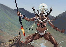
During the plane ride from California, I started exploring how the characters might be depicted in an African setting. The design of the beast went through several iterations inspired by memories of masks, insects, skulls elephants, rhinos, and even a white orchid.
I still have strong memories of the first night of working well into the evening seated on my drawing horse with pages of sketches strewn about. I had decided to develop two thumbnails into tight roughs in pencil. Along the way, one was abandoned when it became clear that I was rapidly losing touch with the root concept, and a shimmering image still burned into my imagination. My reference for the creature was easy to find online, but I was worried about finding a dark-skinned woman to pose for me.
Rebecca Guay was partial to the concept with the characters embracing. So much of my strongest work is lacking in emotion and narrative because it's inspired by pin-up art with a sci-fi/fantasty flavor. Something about the pin-up format has always attracted me, but Rebecca's work consistently has a strong sense of intimacy, particularly when she draws couples. With just a few marks and a strip of tracing paper, she was able to tweak one of my thumbnails just enough to push the composition toward a stronger concept, and potentially a stronger painting.(I managed to spirit away her little sketch as a souvenir before it got tossed.) She was also the one who pointed out my avoidance of hands and feet in my sketches during the first day crit. (Thanks, Rebecca. I'm working on it)
The images above show just how strongly Rebecca's little drawing influenced one of my revised roughs. My painting shifted away from this composition, but I may return to it for another piece at a future date. I realize now that I have a tendency to abandon things that either don't seem to be working, or think I've already gotten all that I'm going to get out of it. Or, I go to the other extreme and spend too much time on a dead end.
James Gurney talked about importance of taking the time to really thoroughly imagine and design the world your characters occupy as well as the characters themselves. My beast character evloved from sketches like the ones below, and the tusks on the elephant-based designs began to speak to me. Should they be braided, or fused into something like a nose ring, or something else?…
Tuesday, June 22, 2010
IMC 2010
Last week I had a phenomenal experience at the week-long Illustration Master Class at Amherst College in Amherst, Massachusetts. This was my first time, and each day was wroght with the kinds of challenges and inspiration I've been looking for for quite some time. Our instructors included Boris Valljo, Julie Bell, and James Gurney, whose work has inspired and influenced me for many years. In the coming posts, I will do my best to share my experiences, and what I learned along the way.
Meeting James Gurney
By sheer coincidence, I had added Gurney's recent book "Imaginative Reaism"(Andrews Meel Publishing, LLC.) to my library about a month or so before the the workshop. The book thus far has been an excellent read, thorough, and full of good advice on how to improve one's process. (By the way, Imaro fans should note that Jim painted the cover for Imaro II for Daw Books!) Jim's brought along his work table and general setup from home. Later, I'll post shots of the maquette I used during the master class for my "Beauty and the Beast" illustration. Jim shared with us in his presentation how he uses small models to compose everything from creatures to complex architecture before he paints. I had borrowed the first Dinotopia book from library a number of times several years ago, not realizing at the time that the illustrations were done in oil. Jim and his wife Jeanette really made me feel at home in the studio. Really nice folks. I was surprised to learn that Jim also has Bay Area roots. Jim's skills as a thorough researcher, along with his sense of wonder about the world, deeply informs the creative content of his artwork.
Meeting Boris Vallejo
Back in May, one of my sudents gave me a 1978 Boris Vallejo Tarzan calendar as a thank you gift. He wasn't familiar with Boris' work, but had seen samples of my fantasy art and figured I'd appreciate the calendar. My acrylic painting process came directly from Boris' approach detailed in "The Guide to Fantasy Art Techniques" (Paper Tiger) and one his own "how-to" books. I didn't have the nerve to bring it along and ask for an autograph, but I kinda wish I had. During one of the lectures, he actually mentioned how convincing a publisher to let him do the Tarzan calendar was an important point in his career. I was such a fan of his work that I started collecting trading cards with his art.
Meeting Julie Bell
I should also mention Julie Bell. As a 17-year-old freshman at San Jose State University, I remember coming across Heavy Metal in the student bookstore. I bought my first issue, which featured a classic Luis Royo femme fatale on the cover. Heavy Metal had always been on of those on the fence publications that would either be behind the counter next to Playboy and Penthouse, or mixed in with the men's magazines, well out of reach of children. One of the most memorable covers was Julie Bell's "Feast" (1993) which featured two women in a cave feasting on a slain beast with chrome bones. The naturalistic figures and Vallejo-esque textures and details made her work an instant favorite of mine back then. I started to recall how Julie's approach had a slightly different flavor, at times more feminine, but still, consistently bold and appropriate for the industry.
You can probably imagine how surreal it was to be visited by Boris and Julie while working on my interpretation of "Beauty and the Beast". I had spent so many years admiring their work, and imagining what it might be like to actually meet them. They were very supportive and insightful. I regret getting so engrossed in my own work that I missed out on seeing their painting demos on the second floor. I think it was during Greg Manchess' lecture that there was a mention of "art heroes". I've had many throughout my life, but I never imagined having two standing behind me as I struggle with a painting. When I was 17, I routinely painted on my bedroom floor with examples of Boris and Julie's strewn about for inspiration. I even worked in layers, starting with carefully gessoed illustration board. Working with oils was out of the question, I learned to at least think in terms of gradually building up layers of color. One of the last things Julie mentioned to me was that my reference would critical to the success of the piece. I should add that will be true for any works in progress or future works that involve the human form, or anything based on the real world.
"Don't write that down! You already knew that!"
Notes on Day 1
Our first day crit included James Gurney, Greg Manchess, Scott Fischer, and Jeremy Jarvis. The feedback was honest and very helpful. Some of my classmates arrived with highly developed sketches. I was still flailing about trying to design my characters and decide on a composition. When I was reminded of my tendency to avoid hands and feet, Jeremy saw me taking notes and goes "Don't write that down! You already knew that!" Which was true. When I sketch, the long, flowing marks I use always take precedence over the smaller, tighter ones I should be using on my hands and feet. My turn came about halfway through the crit. Feeling a bit unprepared, I posted a column of sketches and one page of thumbnails. Jim commented on my interest in visualizing the world my characters would inhabit. When I explained that I wanted my beauty to be a dark-skinned African woman, he Jeremy jokingly asked "Could you give her Caucasian features to keep from making everyone here uncomfortable?" It was a great line. And to his credit, Jeremy had mentioned early on in the crit the need for all of us to not only get comfortable with painting ourselves and what's familiar, but to also learn to paint people different from ourselves.
I learned through the Master Class that Wizards of the Coast actually does encourage its artists to infuse some diversity into the design of the human characters that appear in Magic the Gathering. I saw evidence of this in the style guide we were provided with for the Magic card assignment. But, these images tend not to be showcased on the website, packaging or other promotional materials for the game, which is odd. I'm sure it has something to do with marketing.
By the time we reached the halfway point, I was back at my easel working on two concepts that showed promise based on the instructor feedback. I must have worked until 2 a.m., eventually abandoning one of the sketches that just wasn't coming together. I chose to stick to a tightly cropped medium close-up of Beauty embracing one of the beast's tentacles. Remembering Harrison Chua's advice to save my energy and not stay up too late, I ended up returning to my room barely able to sleep.
ery
----
Thursday, May 20, 2010
It's been a busy couple of months, but I plan to return to painting very soon. On the top of my list are three incomplete works, including the banner for this blog, the Mama Nunusshu piece, and the vampire cyborg below.
I have also entered the planning stages for a short teaser trailer for the Afroid story, the redraw of the second Guila installment (to be sold via IndyPlanet.com) and my first series of t-shirts to promote and fund the Afroid project.
I've also completed a level 1 kanji class at City College of San Francisco with ラスチガン先生。I learned a lot, but I have a long way to go if I ever hope to become functionally literate Japanese. There's a fascinating correlation between writing and drawing rooted in the Chinese characters used for the kanji. For me, a high level of concentration is needed just to get all of the marks to balance in terms of spacing and proportion.
I also had an opportunity to study with artist Aiqin Zhou at the Richmond Art Center. Her Chinese calligraphy course introduced me to the classical art behind the kana and kanji. I feel lucky to have gotten to try my own hand at this rich and beautiful tradition. I'm also painting with my right hand for the first time in my life, which makes me wonder how further practice might rewire my brain after a lifetime of writing, drawing and painting with my left hand.
The good weather here in the East Bay resulted in an explosion in wild flowers growing around town, some in gardens, and others growing wild. The colors are vibrant and inspiring. Even the cherry blossoms bloomed for an especially long period of time this year. The rains also brought a lot of weeds, so I've been spending weekend mornings hacking and pulling with a curious calico looking on.
Anyway, I'm looking forward to getting back to the art stuff very soon.
Sunday, April 4, 2010
Mama Nunuusha
A couple of weeks ago, a sketch inspired by the "Massive Mama Shun'Ngu" concept inpired me to attempt another giant African monster-queen. Mama Nunuusha seems to be evolving into a minion summoned by dabblers in evil magic. The challenge the far has been getting the colors to balance along with the composition, but the skin tones seem like an improvement over previous attempts at depicting brown skin. At some point I'll have to get bold with the shadows, but the soft details in the landscape are working. The desaturated compliments are helping to suggest foliage and rock. I'm not yet sure why this feels so static and flat, though, and whether or not it that problem can be easily fixed along the way.
Manga Studio DX is proving to be an excellent digital tool for future comic book projects. I'm very happy with this investment. The piece above is a recent experiment created from scratch using Manga Studio, a Wacaom Intuos 3, and a 6D Artpen.
Thursday, March 4, 2010
More on "Traluka"
This piece has taken an interesting turn. The hair, for one, is much fuller and life-like. And, I think the added vines might be a fun challenge, although, the greenness and thickness of them isn't quite working yet. I'm just now noticing that the piece has hints of Laura K. Cannon's "Mhiet'e", which is one of my favorites. More to come…
Monday, February 22, 2010
"Triage"
In anticipation of possibly attending this year's Illustration Master Class in Amherst, Massachusetts, I've started an oil painting inspired sci-fi self-portrait. The concept started out as a simple painting of an aging starship captain, but it has thus far evolved into more of an undersea crisis.
This exercise is forcing me to come to terms with the myriad reasons why I tend to avoid using photographic reference. My long-term goal is to incorporate more photo ref into my work, and to do so with confidence.
[Work in Progress thread at Epilogue.net ]
Saturday, February 13, 2010
"Dranal" nears completion
I think I started "Dranal" around mid-year in 2009, and set it aside. And while I don't remember what specifically inspired the piece, it's interesting to note the popularity of Old Testament-inspired "angels vs. demons" themed works currently on the market, and continued influence of "goth" subculture on fantasy art, games, literature, film, and fashion. The digital paintings of New Zealand artist Rochelle Green are still among of my personal favorites of the genre. Her art resonates with an elegant blend of horror, eroticism and tragic beauty.
So it's fair to say that I have Green, along with several other artists to thank for setting the bar high for this kind of work, which is still very much outside of my confort zone. "Dranal" is a study, and as such, wrought with little imperfections, discoveries and experiments. I am especially enjoying using a looser, more textural technique, and exploring ways of putting more color into shadows in skin tones. I expect to have the finished piece posted in a week or so.
Saturday, February 6, 2010
Hat Tossings
Well, it looks like my entries for this year's Spectrum arrived on time via Fed Ex. Surprisingly, I didn't do much painting in 2009. Instead, I worked on fewer pieces over an extended period of time.
I've also started a thread over at CGSociety for their B-Movie challenge. There, I'm developing a movie poster about a monster made of movie posters, tentatively named "Pulpo". These challenges are always a good way for me to reflect on my own process, particularly the things I do first, and the things I tend to avoid until I absolutely have to do them. Right now, the need to build a paper model of the creature is knawing at me. I also expect to need to paint an urban street scene, possibly with people running around. Crowds and buildings seem to be a challenge for me at the moment.
I'm also enjoying my weekly "drawing circus" class meetings with Edward Stanton at the Richmond Art Center. I spent the last class cutting silhouettes from pages torn form an old issue of Art Forum magazine while the model, Lala, posed and danced. The forms I ended up with were for the most part figurative, some grotesque and distorted. Many would make great creature designs. "Drawing" with a sharp pair of scissors is a lot of fun and seems to come naturally.
Saturday, January 2, 2010
Traluka: Work in Progress
Here's a piece that has been painted completely from scratch with some occasional rummaging about my many pose and reference files to get a sense of how things probably should be. Naturally, things never turn out accurately when working this way, so I see it as more of a study, or a way to challenge myself.
I still hold my Moon Hammer painting up as my best attempt at painting drapery without reference, but the billowing folds of her skirt still have many pockets of questionable physics. There seems to be a rhythm to it all, and as long as I think carefully about what's going on, good things tend to happen.
At this stage, I'm tempted to incoroprate a few tekky, hex-like forms like the ones that appear in fantasy game art. She's turning out to be something like a cybernetic vampire (did you notice the glowing bite marks on he neck?). The weapon thing is turning into an opportunity to practice painting hardware out of my head. I still have fond memories of the utility belts featured on various characters in the first Star Wars films. Strange facsimiles of some of those props would even end up molded into the bodies of the action figures based on characters from the film. All I had at the time was my imagination, or fuzzy memories of what happened in the films, to determine what was what. So much of it was vague, but nice to look at. Perhaps that's an important key to designing good science fiction illustration.
I also plan to launch into another Afroid crossover piece currently shown in the header of my blog. It's based on a photograph of Shari Joy (RoseOnyxis) posted at DA in 2009. Artists like Donato Giancola and Roberto Ferri have inspired me to go for a more glowing, oil-like look in at least one piece. This will mean breaking away from my deep resistance to relying too much on reference, which might be considered a hinderence of sorts, considering how it often disrupts the process of painting. My version of Bourguereau's Nymphs and Satyrs is a good example of how having to repaint a foot or an arm or a face repeatedly often leads to a lack of cohesion. The final version has lots satisfying parts, but had I worked more on the original composition it might have turned out better. Looking back, I know I was torn between doing a direct translation and making it my own by including several deliberate adjustments to the figures. Nonetheless, it was a great learning process.