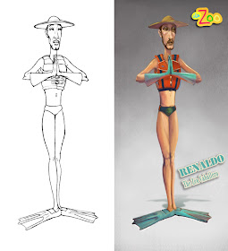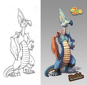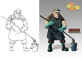
Revisiting recent projects from ANM 633 Character Design for Animators is turning out to be not only a lot of fun, but also an opportunity to apply some new tools and techniques learned in ANM 611 Visual Elements of Storytelling. Because it was a summer course, ANM 633 went at a breakneck pace, forcing me to assimilate a lot of valuable information in a very short period of time. I was more than a little unprepared for the class. Yes, I've watched tons of animated shows since childhood, but I never took to time to thoroughly study a given style or genre. Character design reinforces my belief that simple designs are hard. Add turnarounds, action poses, expressions and building maquettes, and suddenly you have the ultimate test of your current skill set.
I've had time this week to revisit some of the more successful character designs, and practice rendering them digitally using an approach learned this semester in ANM 611.

The zoo assignment required us to create a line up that includes a hero and heroine, villain, sidekick, and a hybrid creature pieced together from studies done during a trip to the San Francisco Zoo.

Going to a course like this cold is tricky, mainly because without a preferred style or genre to drive my work, the designs throughout the semester were fairly hit or miss. I will have to practice a lot more if I hope to achieve my long-term goal of being able to consistently create appealing, and well-designed characters for a variety of genres.

I was introduced to this style of rendering towards the end of ANM 611. While I would prefer to paint over a more rendered character, I found that having the freedom to invent volume using only contour lines was a fun challenge. The designs naturally change a bit to fit with a more realistically rendered look. I start by isolating the character silhouette with the Magic Wand, and then capture the selection as an alpha channel. I also use the selection to create a Color Fill Adjustment Layer with a dark, cool color. Then, I set that layer to Multiply, and paint into the layer mask in order to establish the form and cast shadows. I then rough in the flat colors on another layer set to multiply with the selection derived from the silhouette still active. (Keeping the selection active prevents the paint from going outside of the silhouette.)
When I am happy with the overall color and value scheme, I merge all three layers, and then delete the surrounding white from the line art layer. I also add a simple gradient behind the character on a separate layer. From this point forward, I paint with a single layer, gradually painting out the lines, adding texture, detail, etc.
Everything could be pushed even more with these designs, starting with the shapes and line of action. These days I am much more in tune with what kinds of character design stop me in my tracks and take my breath away, and with practice, I hope to further develop my own personal voice for character design.

No comments:
Post a Comment