Pages

Friday, December 30, 2011


Revisiting recent projects from ANM 633 Character Design for Animators is turning out to be not only a lot of fun, but also an opportunity to apply some new tools and techniques learned in ANM 611 Visual Elements of Storytelling. Because it was a summer course, ANM 633 went at a breakneck pace, forcing me to assimilate a lot of valuable information in a very short period of time. I was more than a little unprepared for the class. Yes, I've watched tons of animated shows since childhood, but I never took to time to thoroughly study a given style or genre. Character design reinforces my belief that simple designs are hard. Add turnarounds, action poses, expressions and building maquettes, and suddenly you have the ultimate test of your current skill set.

I've had time this week to revisit some of the more successful character designs, and practice rendering them digitally using an approach learned this semester in ANM 611.


The zoo assignment required us to create a line up that includes a hero and heroine, villain, sidekick, and a hybrid creature pieced together from studies done during a trip to the San Francisco Zoo.

Going to a course like this cold is tricky, mainly because without a preferred style or genre to drive my work, the designs throughout the semester were fairly hit or miss. I will have to practice a lot more if I hope to achieve my long-term goal of being able to consistently create appealing, and well-designed characters for a variety of genres.


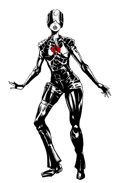
I was introduced to this style of rendering towards the end of ANM 611. While I would prefer to paint over a more rendered character, I found that having the freedom to invent volume using only contour lines was a fun challenge. The designs naturally change a bit to fit with a more realistically rendered look. I start by isolating the character silhouette with the Magic Wand, and then capture the selection as an alpha channel. I also use the selection to create a Color Fill Adjustment Layer with a dark, cool color. Then, I set that layer to Multiply, and paint into the layer mask in order to establish the form and cast shadows. I then rough in the flat colors on another layer set to multiply with the selection derived from the silhouette still active. (Keeping the selection active prevents the paint from going outside of the silhouette.)

When I am happy with the overall color and value scheme, I merge all three layers, and then delete the surrounding white from the line art layer. I also add a simple gradient behind the character on a separate layer. From this point forward, I paint with a single layer, gradually painting out the lines, adding texture, detail, etc.

Everything could be pushed even more with these designs, starting with the shapes and line of action. These days I am much more in tune with what kinds of character design stop me in my tracks and take my breath away, and with practice, I hope to further develop my own personal voice for character design.

Saturday, November 26, 2011

A Return to Gouache

A recent Visual Elements of Storytelling assignment has reintroduced me to the joy and craft of painting with gouache. This study was inspired by one of the CTNx staff members who seemed to be everywhere at once. I distinctly remembered her cafe au lait skin tone, petite frame, and movie star looks and wanted to take a stab at a simple caricature. My timidness with photographing people in public forced me to visualize as best I could the jist of her overall appearance, although, this is hardly a likeness.


The first step was to scan the sketch and then to paint a quick color study on a thumbnail of the scan within the same digital canvas. Next, I sampled the main colors and set them up as a vertical column of swatches. The entire image was then printed onto a letter-sized (8.5 in. x 11 in.) sheet of Strathmore 500 Series Aquarius II watercolor paper. This was my first time using the product, which I obtained from a recent demonstration at the Academy of Art Universty.The paper is very lightweight compared to the watercolor paper I usually use, and it's about as thin as 2-ply bristol. In spite of its thinness, the paper remained flat and smooth, even with heavy applications of the gouache.

The final was then rescanned at a high resolution and medium sharpening on an HP 3000 series all-in-one scanner. This resulted in a slightly distracting texture on the image, which I tried to minimize with a blur filter. Over the past few months I've been fascinated be the vibrancy of color I've seen other students and professionals achieve with gouache. The sketch below was also inspired by the memory of a conference attendee, this time in San Jose at Fanime back in June of this year. I couldn't quite tell if she was in costume or just had a unique fashion sense. I think the shirt was originally cotton with a red and blue plaid pattern, but I took a stab at something different, but still thinking in terms of a triadic color scheme.

I intend to continue with these, maybe doing two or three per week. I see so many inspiring personalities out there that sometimes I just want to spend the whole day creating characters based on the people I see around me.

One little painting at a time…

Thursday, July 14, 2011

IMC 2011 Wrap Up


I'm putting the last bit of polish on this one. I'm still a bit unhappy with certain details, but if this were a real-world piece, I would have to eventually stop working on it. I did the finish over a scan of the painting using Photoshop. I experimented a bit with the a couple of custom bristle brushes. It's been a long time since I've painted digitally, so I'm a bit rusty.

I think this might look good as a small poster. I found a good deal on 12" x 17" cover stock prints with a local printer that I'll have to jump on by Friday of this week.

Many thanks to Ian McCaig, Greg Manchess, Julie Bell, Boris Vallejo, Scott Allie, Dan Dos Santos, Jeff Mack, Scott Fisher, Donato Giancola, and Rebecca Guay for their feedback and encouragement.

Sunday, July 3, 2011


It looks like I'm on track for a Friday completion date. The priest's garb and staff kinda got away from me, but I wanted to take a chance on adding some complexity to those areas. I may go back in and simplify those parts. I'm almost done with the hands and face of the foreground figure. So much of this piece reminds me of Greg Manchess' mention of how getting the shapes right can be more valuable to a piece than the details.

I'm also trying very hard to resist the temptation to having a glowing object giving off blue smoke coming from the priest's left hand, like a beacon. Looking back over the previous stages, there were times when I probably should have stopped, like when the shadow sides of the figures were more abstract.

In spite of it all, having a somewhat solid structure on which to explore these little details and nuances has really made a difference on this piece. I was very lucky to have Ian McCaig, Rebecca Guay, Julie Bell, and Greg Manchess critique my first sketches.

I'm going to work a bit on my IMC 2010 piece, and then spend some time on homework. Lots to do tonight. And it's a warm night. My stay-wet palette, is finally starting to show sights of drying, but not a lot. I just realized that I'm painting in near-white pants without an apron. Might be a good time to change.

Friday, July 1, 2011

More progress…


I was up early this morning and decided to takeon the dragon's shell and the sky. The blankness of the sky had been bugging me, and I decided to go all out on areas suggesting patches of blue sky peeking through the purple haze. There's a kind of turquoise blue that I've seen in oils and acrylics that until now I've never been able to mix. This time I got pretty close. I worked with a mix of pthalo blue, titanium white, and cadmium lemon yellow. The darker areas have a bit of ultramarine blue. Some of my favorite dragon paintings have amazing, colorful skies. I also tried some warm yellows and oranges on the peaks of some of the ridges on the dragon's underside.

The rocks closest to the figures may need to be reworked a bit. They look like globs of dried poo.
I have a set of basic Golden Open Studio colors that I may experiment with on the remaining details on the skin of the acolytes.

Wednesday, June 29, 2011

IMC 2010/11 Progress


With the demands of my summer classes, I'm limited to just a few hours a day to work on these, but I am making progress. The dragon piece has most of the high-flying dragons painted and screened back with glazes of titanium white. I've also worked on the rocks a bit more. The second figure from the left is still bugging me. He feels awkward and a bit off balance. His hands are also a bit chunky.

I'm also resisting the urge to add more dragons to the background behind the figures. The sky behind them feels empty, but I'm going to try to stay true to the original plan. Although, I could easily explore this in Photoshop, along with some brightly colored costumes for the acolytes and their leader.


The "Beauty and the Beast" piece got a bit of refining, mostly in the cast shadows and edges on the figure and the trunk and head of the beast. I also spent some time on the beast's ear. I may end up repainting Michelle's legs completely from the knee down. Something went terribly wrong in that area, and I've lost the sense that she's actually being cradled by the beast's tusks.
Making great progress on this one as well. And a big THANK YOU to Dan Dos Santos for suggesting a stay-wet tray for my acrylics. I've gone about three days without my paints drying out. More on my paints setup next time.

Saturday, June 25, 2011

Painting Progress


I managed to dedicate about four hours to my IMC 2010 and 2011 projects. My new stay-wet painting tray is making a huge difference. That, and the fact that it's a cool day here in the East Bay. My old "Beauty and the Beast" painting has been sitting by my drawing table for over a year now. I hadn't painted in acrylics since last year's IMC. This morning, it felt like a good time to return to the piece after reworking and further developing parts of my dragon painting. I had the idea of adding evidence of wear and tear on the parts of the dragon nearest its exhaust, possibly to suggest the age or health of the monster.


The "Beauty and the Beast" piece just needs many more hours of patience and discipline. I'm approaching with a combination of glazing and opaque applications of paint, slowly finding my way.

IMC Day 4 and 5

My dragon model didn't hold up to an application of black acrylic paint, but it still proved useful along the way. I decided to start on the sky first in order to get over the initial anxiety of committing paint to the board. I had never worked much with magenta, pthalo blue or Naples yellow, but together they created a nice foundation for the sky. My paint set up was all wrong. I learned late Thursday night from Dan Dos Santos that I should work with the paints in a tray with a bed of moist paper towels. The normal palette that I always use at home was letting the paint dry too quickly. I was also starting to regret choosing not to bring my oils this time.

At this point, I took a chance on painting the shadows with a base of warm colors. I wasn't sure if these colors would end up buried under additional layers of paint, or if I might keep them like this, thus minimizing the amount of detail in the shadows.


I also found later that my camera had grossly exaggerated the head of the foreground figure. Jeff Mack kindly did a few corrections to the figure, and shared with me his cloud painting technique used with acrylics. Jeff used a vigorous scumbling technique with a round brush to simultaneously push and blend the paint. The result is texture similar to that of an orange peel.

With just one more night before the final show, I put every ounce of energy into the figures. I eventually had to accept that the piece would not be finished by the end. The priest's outstretched hand also wasn't reading well, so I painted over it with the sky color. Somehow the design of the dragon itself had also changed along the way. It was missing a shell segment near it's tail. Without it, it does look a bit more sleek and aggressive, but I would like for it to be true to the original concept. One habit I'm trying to break is that of changing things when I get to the painting phase. The temptation to make even minor tweaks is always there, but it's risky to experiment like that with traditional media.


The surface of the dragon was inspired in part by volcanic glass and bones. It looked really good when initially painted with dark, cool blacks, but the blurriness of the composite gave the low-flying dragon a greater sense of scale. Having it more in focus is what I imagined for the scene. The dragons are closer to the size of modern fighter jets, as opposed alien mother ships.

The images above are more or less where I stopped painting at 5:00 a.m. on Thursday night. The night before I had stayed up to about the same time working on a drawing for the faculty gifts organized by Tara Larsen Chang. She was kind enough to entrust me with the task of personalizing the first few pages of the Moleskine included in Boris Vallejo's gift. I found myself reverting back to my love of rendering organic forms in graphite right out of my head. The drawing went surprisingly well. Writing a dedication page was very hard. I was so nervous about misspelling something that I wrote the message in pencil first, then in ink. Then, I realized later that I had forgotten to erase the pencil. Nonetheless, it was huge honor considering how long I've enjoyed and studied Boris' work. I ended up missing the closing ceremonies on Friday at 2:00 p.m. when the gifts were handed out. I had gone back to my room to get something, and ended up taking a 30 minute nap.

Overall, IMC 2011 was yet another challenging and inspiring experience. I'm not sure if I'll go again next year. My short-term goal is to be very busy with projects and preparing for midpoint review at AAU. My long-term goal is to crank out about 10 years of strong professional work. It's time.

IMC Day 3 and 4


The first of the guest lectures on Monday were fantastic. We saw Peter de Seve, Mo Willems. De Seve has been one of my favorite illustrators for a long time. He gave an inspiring presentation at CCA several years ago, and since then I've been of his work and sense of humor. Willems, on the other hand, was new to me. I had seen one or two of his books on the shelf, but never felt compelled to pick one up. Aside from also having a great sense of humor, he has a mastery of storytelling, and shared a handful of tips and techniques for effectively pacing a story with color, text and composition.

I was able to squeeze in a photoshoot with the help of Mike Maung who sat to the left of me in the first floor studio. He posed as the dragonist priest, and I posed for the acolytes. The lights had already been broken down from the previous night's photoshoot, so we did our best with the interior lights in the auditorium. They had just enough intensity to give me some good shadows and highlights. Unfortunately, my camera was set to shoot at low resolution. The lack of a proper long lens also resulted in some distortions on some of the reference.

The next step was to create a composite of the dragon sketch and the photo reference. At this point, I was debating as to whether or not I should just mount and paint over the digital composite, or spend time drawing it again in graphite, and then fixing and mounting that drawing to my board. I opted for tracing the general contours from the composite on design vellum, and then transferring the lines to my illustration board after its layer of gesso was dry.

Drew Baker was kind enough to make his printer available to us during the week, so I was able to print a sheet of roughly quarter-sized grayscale versions of the composite, and a few sheets of reference images. I had a tough time deciding on a palette for the figures in the foreground. Should it be monochromatic, or should I separate them from the background with color? I met my goal of getting to the painting phase by Wednesday, but still had a few questions about how to proceed.

Sunday, June 12, 2011

IMC 2011 Day 2

I made some good progress today. It's already around 1:30 A.M. and I have a few more minutes of energy to share today's experiences.

This morning started with a short jog to the campus memorial, a few stairs, some calisthenics down by the baseball field. A light breakfast followed and I spend the first few hours further developing my new sketch. The cropping along with the addition of several other dragons in the sky felt like a good decision, so I stuck with it and moved on to a larger value study. Right now, the figures are the biggest challenge. My classmates have been shooting some really gorgeous reference (of some really gorgeous classmates). Details like hands, folds and facial expressions tend to look their best when done with proper reference. Tomorrow will be the day for shooting my photos.

This morning, I also followed through on my decision to at least attempt a paper model, and it was surprisingly successful. The downside was that it reminded me completely by accident that the u-dragon actually looks best when I reverse the head and tail. If I decide to flip it, I'll do the work in Photoshop to avoid driving myself crazy with yet another value study.

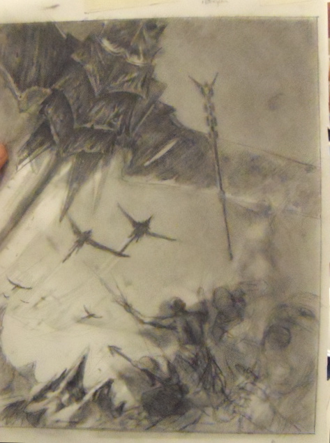
The value study also led to some interesting textures, and a few new ideas on what parts of the dragons might be illuminated other than the areas closest to their exhaust organs.
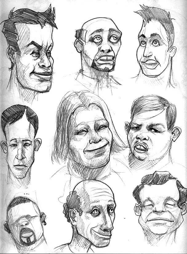
 I also have a pinch of black Sculpey 3 to help with referencing the surfaces of the dragon's shell. I'm looking forward to getting some much-needed rest.

Saturday, June 11, 2011

IMC 2011 Day 1

It's close to midnight on the first day of crits and lectures, but it feels like I've been here for a few days already. I'm not too happy with not making time to prepare a stronger batch of sketches for today, but it was a busy and hectic week back home.

I have settled on a scene with a uranium dragon (u-dragon) from my Dragonist mythos. It depicts a u-dragon in streaking overhead while congregation of Dragonist clergy and acolytes gather on a craggy cliff. My goal is to complete the drawing by Monday afternoon before starting in on the painting. Thus far, the biggest stumbling block has been in choosing a cropping for the main u-dragon overhead. The scene is fairly effective with the entire dragon in view, although most read it as an alien machine of some kind, mainly because of the overall form and vapor trail from its hind quarters. And yet again, some conflicts and doubts about the piece have already begun to set in in ways that they never did when I worked on personal pieces. Come to think of it, it is a bit too much to digest input from several people, including peers and faculty. But ultimately, it comes down to making a decision about which advice to follow.

Goals:
a strong, memorable composition
a successful group scene from quality reference
a vibrant color palette
an original an inspiring dragon concept

Limits and Challenges:
1. first attempt at a major group scene
2. u-dragon design unresolved
3. dragon form reads better in other sketch

Resolutions to above:
1. Have classmates pose, or build costumes from sheets, towels, etc.
2. Silhouette is strong. should try cut paper model tomorrow, like Gurney.
3. Save it for another painting.

Lastly, I should mention that author Milton Davis (Changa's Safari) was kind enough to pen an amazing draft for a Dragonist short story called "The Signal" My original plan was to take on a critical scene from the story for IMC, but that will have to happen later this year. This collaboration has been very exciting thus far. Milton has a real talent for storytelling, and he has been very helpful in helping me to move this concept to the next level.

This year's lecture on using reference included Greg Manchess, Scott M. Fisher, and Dan Dos Santos. Each had roughly 20 seconds to explain each of their slides (an average of about ten or so) and share their process for using and manipulating reference. We also got a crash course in photographing with lights, and a fun lecture from Ian McCaig mostly focused on drawing and inspiration. After last night's lack of sleep and the general good energy and anxiety, I'm feeling a bit more relaxed tonight.

I'm going to attempt one last sketch before turning in.

Thursday, May 19, 2011

IMC 2011

The Illustration Master Class takes place from June 11-June 18 in Amherst, Massachusetts. This year's master class brings together some of the best science fiction and fantasy illustrators, including Boris Vallejo, Julie Bell, Ian McCaig(!!!), Dan Dos Santos, Donato Giancola, Scott Fisher, Greg Manchess, and IMC founder, Rebecca Guay.

Enrollment usually opens toward the end of the year, and contninues through early March. Apply early to take advantage of the early-bird discount.

Contact Rebecca Guay for info on available spots at this year's master class at: http://www.illustrationmasterclass.com/registrationpayment.html

http://www.illustrationmasterclass.com/

Tuesday, January 11, 2011

20 Heads or Faces


Ever have one of those nights where you just want to hammer away at something until it's done? After visiting the 25 Years of Pixar exhibition at the Oakland Musuem of California, I realized how little experience I have with caricatures and cartoons. The exhibition was very large, and took up a sizable portion of the museum. The art included several drawings, sculptures, paintings, and a short film the brought to life several layouts from various films. There was also a bizarre zoetrope with a wedding cake-like arrangement of characters that appeared to move around as the contraption spun under a strobe light.

I learned a few new terms at the show, including "colorscript" which I think is a way of mapping out the colors for an entire film as a large storyboard. Some of the sculptors included. Budd Luckey (Toy Story), Greg Dykstra (Ratatouille, Up) , Kent Molton (The Incredibles). I spent a lot of time staring at Tia Kratter's acrylic paintings from "A Bug's Life" which had some incredibly rich and vibrant color combinations.

A colleague who had also visited the show had mentioned how happy seeing all the work in one place made her feel. I spent close to three hours sketching things, mostly the sculptures, and immersing myself in as many patterns and details I could discover through drawing. Most of the heads and figures were based on a strong silhouette, gesture, or something living, but then simplified down to their essential planes and edges. Eyes and eyelids were particularly interesting. The question of how to translate an artist's sketch into a solid object isn't always as obvious as it may seem. For example, when should a pupil be a hole versus a raised dot? How exactly should a tuft of hair be simplified into a smooth volume? The lighting in the exhibition was just right for exploring these little details.

In other news. I picked up a mini Raffy DIY toy yesterday. Not sure what I want to do with it, but it's a little giraffe with a big head and stubby legs. This might be a good excuse to get a Dremel tool. I look forward to digging through my old scale model kit parts and possibly bringing out the Sculpey again. More to come…

Friday, January 7, 2011

Cobra Telekinetic


This was fun. I was hanging out with a friend sketching at the Emeryville B & N when I finally wrapped up the pencils on this one, which were done on a sheet of bond scratch paper. I wanted to try out Painter 11's inking tools on a scan of the sketch.

My biggest challenge with Painter continues to be the slowness of the interface. Photoshop has considerably more easily accessed features that enable me to work with more speed and efficiency. Nonetheless, I found the inking tools to be easy to control. I also want to experiment with my 6D pen. I'd like to be able to do the kind of crisp and controlled feathering and fine line detail that I can achieve by hand, or with a brush.
Well, I still have to say the MangaStudio is still #1 for digital inking, but in time, I might get skillful enough to make Painter my second choice.

Thursday, January 6, 2011

A Little Diversion

I remember jotting down a few sketches of a Hello Kitty spoof called "Hella Kitty" The idea was to merge the image of an unabashedly loud, obnoxious and ghetto-fabulous female with that of Sanrio's popular super-cute character. The first sketches are buried in a sketchbook or notebook somewhere, but last month I was in the mood to try a series of pencil sketches for the character. I ended up with nine different designs and costumes, all of which reference a style or attitude often seen on the streets of the San Francisco Bay Area. For those who don't know, "hella" is modified version of the phrase "hell of a" that has its roots in Black youth culture. It's used for emphasis, like "very" or "incredibly". One can also expect to hear its less sacrilegious form, "hecka".


I used the sketch above to create a template layer in Illustrator and started building the illustrations one at a time. Although the series definitely lends itself to the "recycling" of parts, I found myself wanting to try different head and body types for most of them. After completing a few, I started to see where simple reflections could be used to speed up the process and ensure symmetry where desired.
The funny thing is that now I find myself "scouting" for new designs while I'm out and about in Berkeley, San Francisco, Richmond, and Oakland. This started out as biting satire, but now I something that will probably keep me busy and entertain for a long time to come. I also think these would make great wallpapers for mobile devices.

So what do you think? Are you a "Hella Kitty" fan?